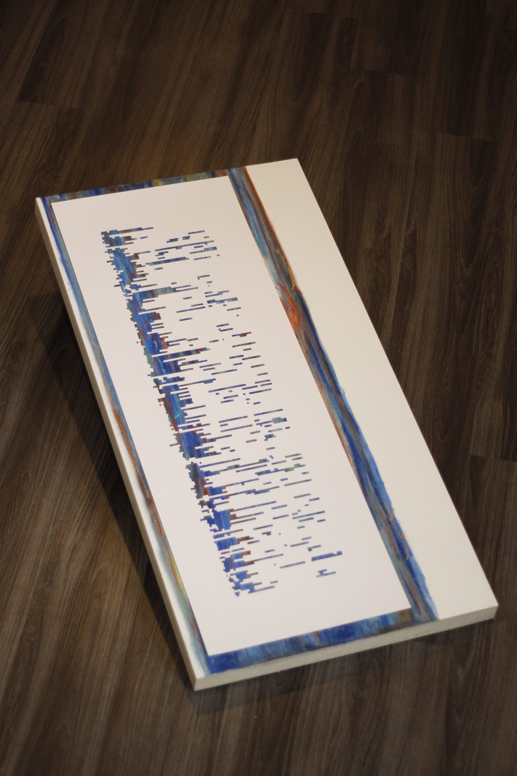


Medium: Hand-cut paper and chalk pastel on wooden canvas.
Size: 18″ x 36″
This work entitled, “Creativity in the Lockdown”, is a data-driven artwork which expresses the rise in arts and crafts during school closures caused by the pandemic.
This project began with a question about what was making people pick up handmade craft hobbies during the pandemic. It seemed too easy to answer this by saying it’s just a stress coping mechanism, or that going back to the roots of hand-made goods is part of human nature.
There were many articles from all sorts of news channels pointing to this trend in the rise of arts and crafts. However, none of them used data to describe what was causing this trend.:
- https://www.refinery29.com/en-us/hobbies-during-quarantine-social-media-trend
- https://www.theglobeandmail.com/business/careers/article-with-spare-time-during-the-pandemic-hobbyists-are-starting-their-own/
- https://www.refinery29.com/en-us/2021/02/10285115/pandemic-hobbies-mental-health-stress-happiness
- https://www.miamistudent.net/article/2021/02/the-rise-of-yarn-crafts-during-the-pandemic?ct=content_open&cv=cbox_featured
- https://www.theguardian.com/business/2020/aug/03/hobbycraft-reports-boom-in-online-sales-since-start-of-pandemic-crafts-coronavirus
- https://www.independent.co.uk/life-style/hobbycraft-online-sales-coronavirus-lockdown-home-crafts-a9650991.html
Despite business lockdowns, stay-at-home orders, and the inconvenience of curb-side pick-ups, it seemed that people were still buying materials from craft stores. Michaels appeared in the NY Times about how it is “bolstered by the pandemic craft boom, [and] is attracting buyout interest from private equity”.
My goal was to visualize data about this booming trend and then create it as an artwork. By recreating the data visualization with tangible art medium*, it would express the subject of crafts which the data represents. To be honest, I didn’t have an audience in mind at this time. I could have gone the easy route to say, “Oh this is just a nice artwork that can hang in an exhibition about COVID”, but I wanted to wait until the artwork was done to see which audience might be the most appropriate.
*Gabby, I know you encouraged me to use “media” in my Assignment 2, but I think using “medium” is more fitting here because this term is used in fine arts to describe the type of materials used!
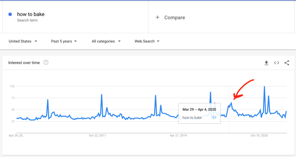
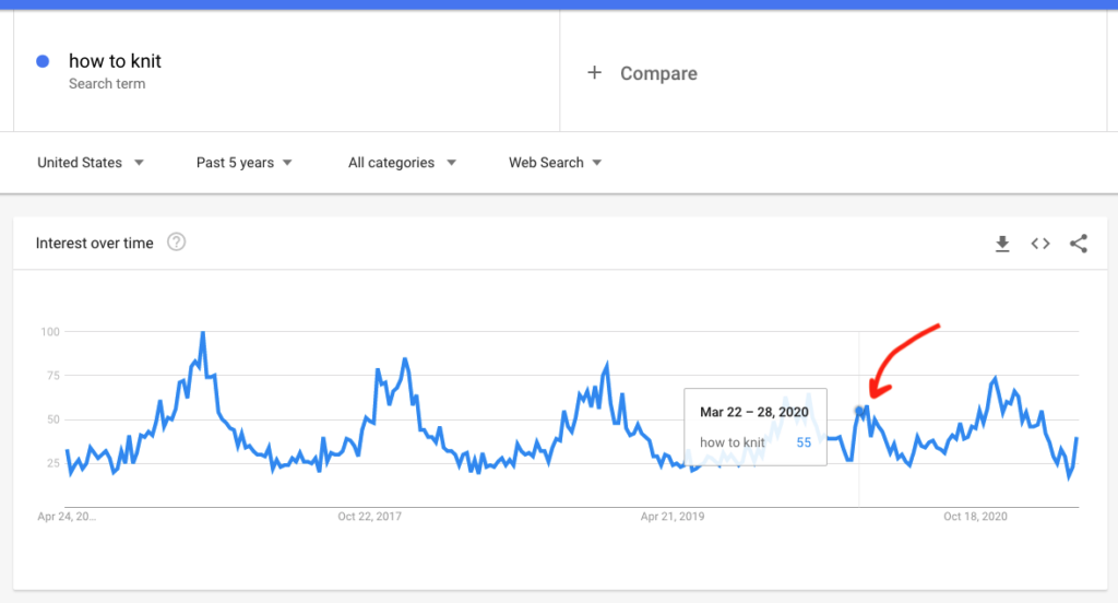
With guidance from my professor, Gabby Resch, I started by looking in Google Trends for how often people searched for:
- How to knit
- How to cross stitch
- How to renovate
- How to bake
Out of these searches, “How to knit” and “How to bake” showed annual patterns. They spiked near November to December over the past five years. However, there was a common anomaly for both of them in March 2020. Before 2020, March was when these search words were the least popular. However, they spiked up in March 2020.
Here are the links to look at these trends up to date (please select “Past 5 years” for the time range)
These patterns were interesting, but I was still not satisfied in my search for what was making people want to knit and bake so much – and why this was popular (at least on Google) in March 2020.
Using Gabby’s advice again, I searched for academic articles about the rise in crafts during the pandemic to see if there were any data figures pointing to another dataset. This was much more difficult than I thought. I found a handful of articles published in 2020 about this trend, but they didn’t have the quantitative sources I needed for data visualization. However, I did come across one paper that looked at “Arts and crafts as an educational strategy and coping mechanism for Republic of Korea and United States parents during the COVID‑19 pandemic” (Choi, Tessler, Kao, 2020). The article used sales figures to describe increase in purchases of educational toys and arts and crafts materials for parents who wanted to keep their children educated and occupied at home during school closures. This sparked an idea about looking for data on school closures to see if there were any correlations with what I found on Google Trends.
I came across the Humanitarian Data Exchange website which had open data on “Global School Closures COVID-19”. The site contained open data on the duration of school closures around the world. They curated the data from UNESCO. I downloaded the data and put it through Tableau to look for patterns. Below are links to different visualizations created with the dataset on duration of school closures around the world. My goal was to choose a graph that was visually striking but still conveyed patterns. There were several categories for types of closures which were: (1) Academic break, (2) Fully open, (3) Partially Open, and (4) Closed due to COVID-19.
- https://public.tableau.com/profile/julia.seo#!/vizhome/SchoolClosureV5/Sheet2
- https://public.tableau.com/profile/julia.seo#!/vizhome/SchoolClosureV4/Sheet3
- https://public.tableau.com/profile/julia.seo#!/vizhome/SchoolClosureV4/Sheet2
- https://public.tableau.com/profile/julia.seo#!/vizhome/SchoolClosureV4/Sheet1
The bar graph looked the most interesting because when the countries were stacked as rows, their duration of closures clustered from March to July 2020. It became clear that schools around the world began closing in March 2020. Below is a link to this graph on Tableau as well as exported images which show the full length of the data visualization. I converted the colours to black, grey, and white for the duration of closures to stand out.
https://public.tableau.com/profile/julia.seo#!/vizhome/SchoolClosureV4/Sheet7


I decided to move forward with this graph in creating my artwork. I wanted to convey a positive message through this work to contrast the tragedy surrounding the pandemic. I wanted to show the silver lining in school closures: in the midst of all these closures, there was a boom of creativity. My narrative began to form to describe how the cluster of global school closures in the spring of 2020 was also a cluster of people growing in their creativity and play.
Satisfied with this narrative, I printed the black and white graph and used it as a template to hand-cut a sheet of thick white paper. I cut out the areas that represented “Closed due to COVID-19”. I wanted to express the idea of creativity being exposed in the time of school closures. So, the paper cut piece would act as a stencil and the background that was exposed would represent creativity. I went through several iterations and experiments with different materials until I achieved the desired outcome.


This work represents the hard work of parents and caregivers as they sought ways to cultivate children’s creativity. It also celebrates the achievement of people who learned new creative skills and hobbies. This work sheds a positive light as it expresses people’s resilience to global changes by turning towards creative expression.
Areas for improvement
For aesthetic reasons, I didn’t include any contextual information such as axis labels and titles. This makes the work inaccessible to those unfamiliar with the context and background. I should have tried creating prototypes where axes labels were included. The data being represented is also limited from February 2020 to May 2021. Since this data was only collected during the closures caused by COVID-19, it does not show patterns of school closures caused by other reasons.
I relied on correlation being a causation through this work. I made an assumption that school closure is a cause of rising trends in crafts only because one article (Choi, Tessler & Kao, 2020) and a cluster of school closures in March correlated with the spike of “How to knit” and “How to bake” searches on Google Trends. I feel very amateur for doing this, but I’m happy with the narrative I achieved through this correlation.
This was my first time trying to make an artistic piece through data visualization in this scale. I want to try more!
References
Choi, M., Tessler, H., & Kao, G. (2020). Arts and crafts as an educational strategy and coping mechanism for Republic of Korea and United states parents during the COVID-19 pandemic. International Review of Education, 66(5-6), 715-735. doi:10.1007/s11159-020-09865-8